


WordPress’s Gutenberg Page Editor is a powerful page builder, giving you the option to build unique pages and posts across your site. One customization choice is the Color Settings panel on many Gutenberg Blocks.
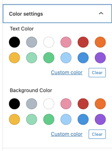
The Color Settings panel gives you a set of pre-defined colors for Text Color and Background Color, as well as a custom color picker.
If you’ve ever wanted to modify these pre-defined colors, this article will tell you how to do that. A few of the benefits to setting your own pre-defined colors include ensuring the brand integrity of your site, ability to easily reuse colors, and to give your site a more custom feel.
How the Color Settings panel works
When you set a Text Color and/or Background Color in the Color Settings panel, using pre-defined colors, it adds classes to the block to define colors. The classes are referenced in Gutenberg’s block library stylesheet.
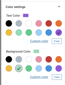
<h2 class="has-vivid-purple-color has-light-green-cyan-background-color has-text-color has-background">
  How the Color Settings panel works
</h2>
Let’s take a look at the classes added to better understand how the color pickers work.
has-vivid-purple-color
This uses a pre-defined hex color of #9b51e0 to make the text purple.
has-light-green-cyan-background-color
This uses a pre-defined hex color of #7bdcb5 to make the background color the greenish color seen above.
has-text-color
This class is used in specific instances to detect if an element has a color specified, primarily to have the block do something if it does not have a color set, using the :not() selector.
has-background
This class tells certain blocks to add top, bottom, left, and right padding. This is mostly used for text blocks, like paragraphs and headings.
Custom Color option
There is also a full color picker under the Custom Color option. This creates inline styles on your element to set the color, like the example below:
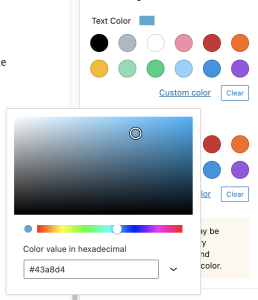
<p class="has-text-color" style="color:#43a8d4">
  This class tells certain blocks to add top, bottom, left, and right padding. This is mostly used for text blocks, like paragraphs and headings.
</p>
Let’s Get Coding!
Now that we understand how the Color Settings work, let’s get coding and set our own custom colors. You will need access to modify some files in their site’s theme, and some knowledge working in PHP and CSS or SCSS.
functions.php
In your theme’s functions file, we’re going to define our colors. This part is what builds out the color pickers in the Color Settings panel in Gutenberg. Here’s our example:
/******************************************************
ADD COLOR PALETTE TO EDITOR
******************************************************/
add_theme_support( 'editor-color-palette', array(
array(
'name' => __( 'Purple', 'themeLangDomain' ),
'slug' => 'purple',
'color' => '#7f4678',
),
array(
'name' => __( 'Dark Purple', 'themeLangDomain' ),
'slug' => 'dark-purple',
'color' => '#4b1a45',
),
array(
'name' => __( 'Yellow', 'themeLangDomain' ),
'slug' => 'yellow',
'color' => '#fedc01',
),
array(
'name' => __( 'Silver', 'themeLangDomain' ),
'slug' => 'silver',
'color' => '#e2e3e4',
),
array(
'name' => __( 'Tan', 'themeLangDomain' ),
'slug' => 'tan',
'color' => '#e0d8be',
),
array(
'name' => __( 'White', 'themeLangDomain' ),
'slug' => 'white',
'color' => '#ffffff',
),
array(
'name' => __( 'Black', 'themeLangDomain' ),
'slug' => 'black',
'color' => '#000000',
),
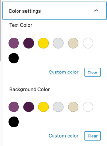
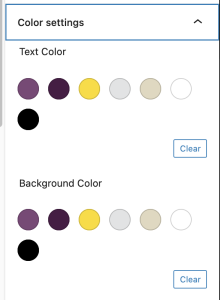
) );The add_theme_support(‘editor-color-palette’) function will remove all of the pre-defined colors, and replace them with what you specify.
Each color has 3 settings:
- Name – This is the display name for the color, when you hover over it’s swatch in the Color Settings panel
- Slug – This is the element used when creating the classes applied to your elements. So if your slug is “dark-purple”, and you set the text color to this, it would apply the “has-dark-purple-color” class to the element.
- Color – This is the hex value of the color. This is ONLY used as the swatch in the Color Settings panel
This is what your color picker would look like with the above php:
If you’d like to remove the Custom Color link at the bottom of the panel, just add this php to your functions file:
add_theme_support( 'disable-custom-colors' );
Now this is what your Color Settings panel will look like:
You can learn more about the WordPress Theme Support features here.
style.css
So everything we’ve done so far won’t change how your site looks to the end-user. That just laid the groundwork for the styles we’re going to apply next.
We now need to add styles for text color and background color for each of our defined colors. This can get tedious, especially with larger color palettes, but after the CSS example, we’ll go over a SCSS solution that’s much easier to maintain.
/* Defile our custom Gutenberg colors: */

/* Text Colors: */
.has-purple-color{
  color: #4b1a45;
}
.has-dark-purple-color{
  color: #7f4678;
}
.has-yellow-color{
  color: #fedc01;
}
.has-silver-color{
  color: #e2e3e4;
}
.has-tan-color{
  color: #e0d8be;
}
.has-white-color{
  color: #ffffff;
}
.has-black-color{
  color: #000000;
}

/* Background Colors: */
/* This includes a fix needed for the Group Block and other blocks that allow semi-transparent backgrounds */
.has-purple-background-color,
.has-purple-background-color.has-background-dim:before{
  background-color: #4b1a45;
}
.has-dark-purple-background-color,
.has-dark-purple-background-color.has-background-dim:before{
  background-color: #7f4678;
}
.has-yellow-background-color,
.has-yellow-background-color.has-background-dim:before{
  background-color: #fedc01;
}
.has-silver-background-color,
.has-silver-background-color.has-background-dim:before{
  background-color: #e2e3e4;
}
.has-tan-background-color,
.has-tan-background-color.has-background-dim:before{
  background-color: #e0d8be;
}
.has-white-background-color,
.has-white-background-color.has-background-dim:before{
  background-color: #ffffff;
}
.has-black-background-color,
.has-black-background-color.has-background-dim:before{
  background-color: #000000;
}
As you can see, this took 55 lines of CSS to set this up. If you use SCSS, there’s a much easier way, using arrays and @each loops.
//Create Array of color slugs and hex values.
$colors: (
	purple: #7f4678,
	dark-purple: #7f4678,
	yellow: #fedc01,
	silver: #e2e3e4,
	tan: #e0d8be,
	white: #ffffff,
	black: #000000
);

//Loop through each color in the array, and set color and background color styles.
@each $key, $val in $colors {
	.has-#{$key}-color {
		color: $val !important;
	}
	.has-#{$key}-background-color,
	.has-#{$key}-background-color.has-background-dim:before{
		background-color: $val;
	}
}
This clocks in at 21 lines, much easier to work with, especially if you need to add, remove, or change any of your colors. The $colors variable contains an array of our color slugs and hex values. Then we loop through each color, creating styles for .has-[THIS COLOR]-color and .has-[THIS COLOR]-background-color classes.
What’s Next?
Putting all of this together, it would be possible to create a plugin for WordPress that has an admin settings page where you define your custom colors, allowing your end users to set their own color palette without needing to touch any site code.